Indoor Lighting Guide
Here we shed light on some tips and tricks that will help with selection, final installation and everything in between.
Choosing The Right Color Temperature
Color temperature is the visual appearance of color of the light, often labeled cool or warm. We use two scales to characterize white light.
Color Rending Index (CRI)
A quantitative measure of the ability of a light source to reveal the colors of various objects accurately in comparison with an ideal light source. The higher the CRI (1 to 100), the better the color rendering, given the color temperature of the lamp.
Think of CRI as how well the light will interpret the true color of an item. 100 is the top "score and would represent what you would see in daytime sunlight.
Think about looking at paint chips in a store versus the parking lot, colors may appear different. Or consider Instagram, have you ever tried a filter that adjusts the color of the meal on your plate, or your hair color? The filter may be adjusting the CRI as part of it's edits.
Correlated Color Temperature (CCT)
CCT is the appearance of white light, in terms of warmth or coolness. A warm color corresponds to a lower CCT, while cool colors are associated with a higher CCT.
Measured in Kelvin on a scale of 1,000-10,000, color temperature describes the appearance of the illumination provided by a bulb. The lower the Kelvin number, the more orange/red/yellow the light. Matching the color of light to the surroundings will create harmony for the eyes and make the space look and feel comfortable and “right.”
Kelvin
The appearance of white light. CCT is defined in degrees Kelvin and correlated to the Black Body on the CIE color diagram. Warm colors correspond to a lower CCT value (2400K), while cooler or blueish light is associated with higher CT values (10,000K).
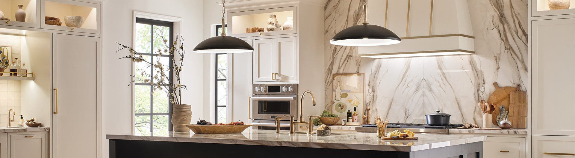
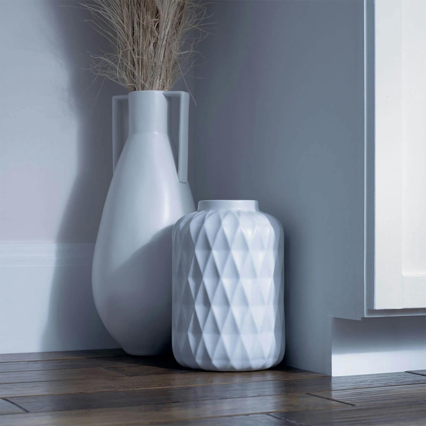
Tip: Using the same color temperature lights throughout a room will give a clean even feel to the space.
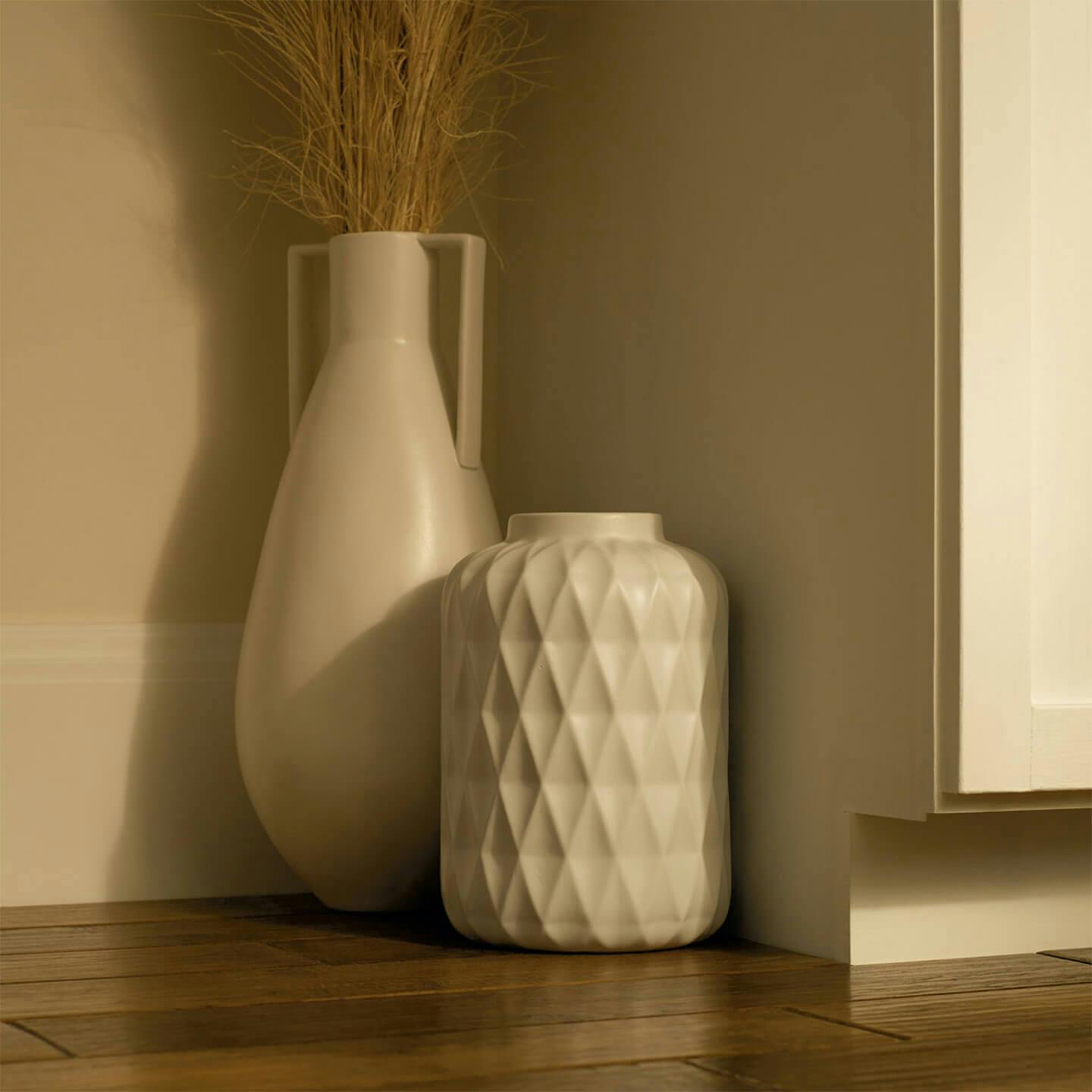
Extra Warm White
2400K
The warm tones of this temperature give off a dim glow of light, similar to what you might find from candlelight; best for low-light areas where ambient illumination is welcomed. This is less commonly used but appropriate for the right setting.
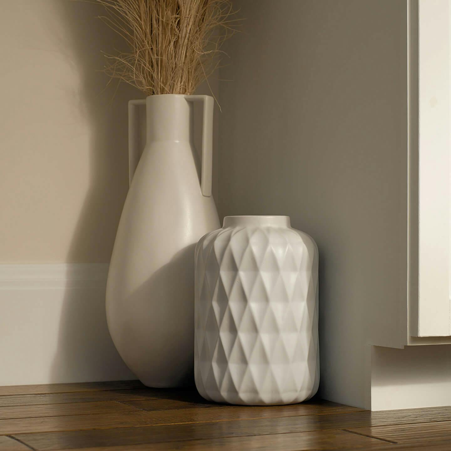
Warm/Soft White
2700K
Kelvin produces a warm and inviting color of light. It is general the color of incandescent lighting. Choose a 2700 Kelvin bulb if the environment includes brown woods or warm colors like red, gold or orange.
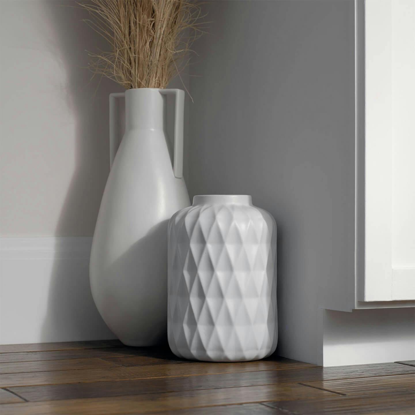
Cool/Pure White
3000K
Kelvin is a cool and vibrant color of illumination. It’s preferred for work spaces, kitchen and bathrooms because of its closeness to morning light. Choose a 3000 Kelvin bulb for environments utilizing lots of cool colors like blue, green, or white. Grey Neutrals and stainless materials also go well with this range of light. For a cooler light, find a light closer to 4000K
Daylight
5000K
Kelvin is considered sunlight at high noon. It has a stark white or bluish appearance. This invigorating color should be used for security lighting, displaying artwork as well as commercial applications